Today marks the launch of Google’s brand new Maps Gallery, and we’re excited to be a part of it!
Google launched the new platform to showcase and distribute custom, interactive maps created by governments, businesses and nonprofits from around the world that are making valuable information available in compelling visual formats to the public.
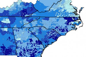
We were among the handful of entities invited by Google to provide maps for the Maps Gallery launch. Our offerings include a map that shows how families in the Southeast pay a higher percentage of their income for electricity compared to the national average, and that those families are primarily concentrated in areas served by rural electric membership cooperatives. Two other maps detail average poverty rate by electric utility territory and loan programs offered in the Southeast

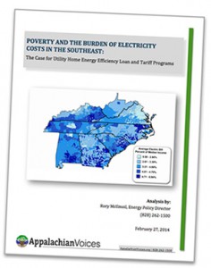
In conjunction with the Maps Gallery launch, we also released today a new report, “Poverty and the Burden of Electricity Costs in the Southeast: The Case for Utility Home Energy Efficiency Loan and Tariff Programs,” that explains in detail the data we pulled from to create the maps.
Also included in our gallery on Google are six maps that look at poverty and health problems in areas with mountaintop removal coal mining.
Read the details on this exciting launch, and view all of our maps in the Gallery at: maps.google.com/gallery/


Leave a Reply